


Since it’s Flashback Friday, the timing is perfect to look back on my trip to Mohawk in upstate New York this past September. And while I learned a lot about the company’s rich history — and got a chance to see the Strathmore Archive in its permanent home — I’ve decided that it’s Mohawk past that brings the medium into the future. Mohawk’s complex framework and especially the people who comprise it all work together to meet the needs of its clients not just today, but tomorrow and all the tomorrows after that as well.
But before I get ahead of myself, let’s go back to September and the gorgeous drive from Cleveland to upstate New York, where the Hudson and Mohawk rivers come together. So I drove there, through all of fall’s most magnificent finery, starting my day at the headquarters in Cohoes.

Once inside, I was able to get a sense of the company’s rich history and very creative culture. Everywhere I looked, there was great design on which to feast the eye. I haven’t worked in an office in years, but this is the kind of place I could assimilate into! For example, check out these vintage dandies used to create watermarks in letterhead.


Above photographs courtesy of David Dyte
Soon, the #BlurbRoadShow arrived. It was all part of the Pulp to Print retreat, two days of inspiration by way of tours, exhibits, discussion and the sharing of ideas and work among creatives: academics, artists, photographers, writers, designers. I was flattered to be a part of the group, which included Blurb‘s Kent Hall, noted illustrator and former Syracuse University Art Professor Roger De Muth and photographer David Dyte. Mohawk’s Creative Director Chris Harrold, Senior Vice President of Marketing Bart Robinson and Director of Public Relations Diane O’Connor made such amazing hosts for us.
We sat down in the conference room, and I’ve got to insert a confession here: I am often prone to spilkas (that’s Yiddish for ants in your pants) during meetings. But meetings will never be the same for me, once I saw how Roger illustrated them as we went with the watercolors he’d brought along.
Photograph courtesy of David Dyte

 Photograph courtesy of Kent Hall
Then, it was time for the Strathmore Archive. TPC readers will be familiar with them — I have blogged about them here and here, not to mention here — but in short, the collection is a treasure trove of rare, historic and beautiful Strathmore paper promotions spanning over 100 years. How well they have held up is testament to the quality of Strathmore, which created them to set their upscale papers apart from other mills. In a visionary move, Strathmore hired the leading illustrators of the day, so they reflect a century of graphic design, type, printing methods and paper making.
Photograph courtesy of David Dyte
They were also nearly thrown away. In 2005, Mohawk purchased the assets of Strathmore — but the archive wasn’t discovered until 2014. Since then, Chris Harrold has served as their vigilant caretaker, spearheading the massive effort to organize them and traveling with them around the world to share them with other lovers of great design. Here he shows them to, from left, Kent Hall, David Dyte and Roger De Muth. Those black boxes in the shelves behind them are also filled with the promotions.
 We were probably there about an hour — and barely scratched the surface of all the design treasures.
Photograph courtesy of David Dyte

 The idea that “paper is part of the picture” runs throughout — I loved this more in-depth explanation of the tagline.
 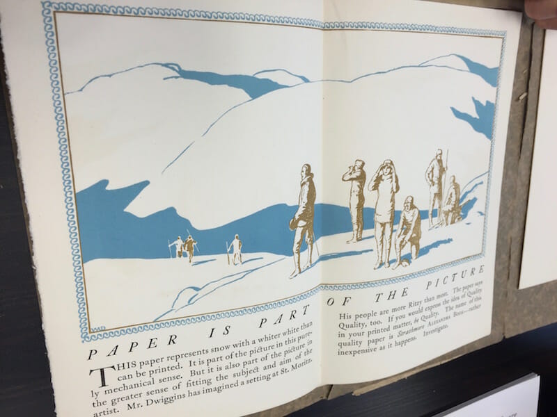 I really hope some of this is turned into wall prints, or stationery — or something! That lettering in the headline below feels as fresh today as it was when it was created. Everything would need to be printed on Strathmore, of course.

 For me, it’s always a treat to see traces of accidental history, like this note attached to one of the books.
 It’s also so interesting to see the nation’s past — in this case WWII shortages — reflected.
Artful interpretations of the Strathmore thistle were seen throughout.


Photograph courtesy of David Dyte
Then we all took a short drive to the Waterford Mill to see how it was all made. Here is where the mill sits — as you can see, it also doubles as a pristine picnic spot!
Photograph courtesy of David Dyte
 The river outside enables this paper pulp river inside.
 There is so much disconnection between ourselves and the objects we use each day. We take them for granted without knowing how it is they came to us. When it comes to paper, this idea was a little embarrassing for me, since I write about it nearly every day but had never seen it come to life. Thankfully I am ignorant no more! We saw paper’s fascinating path from pulp to dryers (shown below) to being rolled onto mammoth rolls.


Three photographs above courtesy of David Dyte
It really is a rare opportunity to come together with other creatives from adjacent worlds to have this experience. It’s one I’ll never forget. Thank you Mohawk — and especially Bart, Chris and Diane — for inviting me!
Meanwhile, I am taking the next week off for the holiday, so TPC will be back the week of November 30. Happy Thanksgiving, everyone!
Photograph courtesy of Diane O’Connor

