


Good morning everyone, here is the last group of Noted @ *Noted finalists!

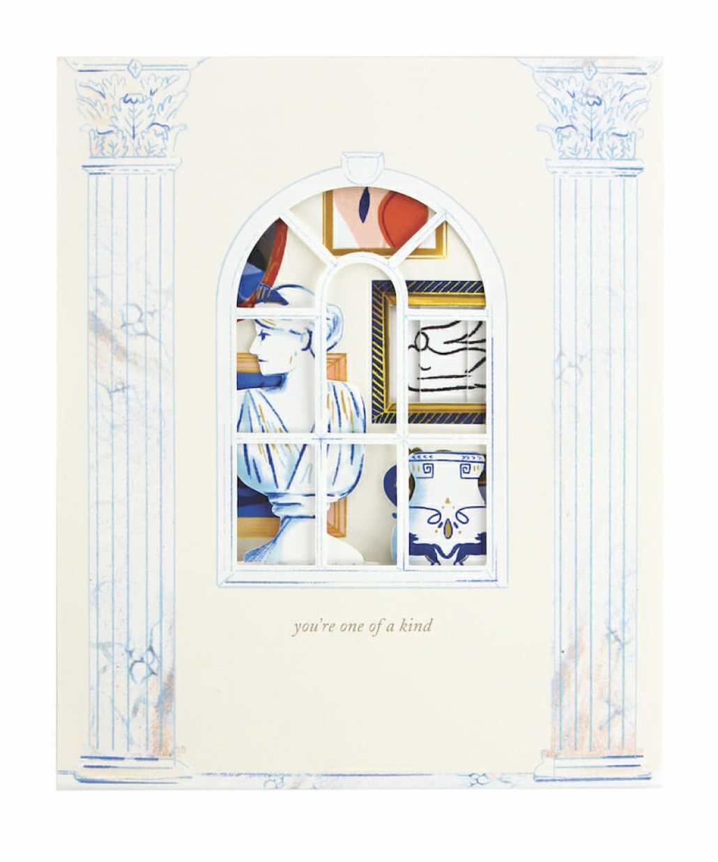
UWP Luxe. As avid fans of salon style gallery wall, we wanted to create a collage of framed art as a pop-up card. We loaded the card with everything we love — from Matisse inspired foliage to classical Greek bust. We also added a cutout window on the cover, allowing the recipient to see the gallery wall before they open the card!

Paper Mirchi. Craft traditions worldwide face serious challenges competing in a world overflowing with technological advances. At Paper Mirchi, we work closely with small family-run units in India, where the artisans are passionate about their craft passed down through generations. Being a qualified textile designer, I understand the processes and techniques as well as the realities of time and labor involved. I love working with the artisans to create new colours and patterns, blending traditional artistry with contemporary designs, in an attempt to create a range of unique luxury papers and cards. Our cards are hand marbled onto 100% tree-free handmade cotton paper. They are hand creased and the envelopes are hand pasted. These are not digitally mass-produced, so every single card we make is truly unique — just like the recipient!
Our luxury hand marbled greeting cards are a real delight for any stationery lover. Each card is hand marbled by a skilled artisan on luxurious tree-free cotton cardstock and is accompanied by a luxury peel-and-seal envelope, which is hand marbled in the matching design on the reverse for understated appeal. The card and envelope are supplied ‘naked’ and neatly held together with a tree-free belly band. Size A6. Blank inside. We currently have a range of 11 stunning colours. We can also do custom colours and bespoke orders. Our marbled greeting cards were launched at Spring Fair (Birmingham) in February 2020 and have had a very successful response.


CharmCat. I wanted to create the most inclusive line of wedding party proposal cards ever! My buttons are always popular at markets so I decided to design a card that incorporated buttons. There’s one card design and you can then add whatever button you want to it, customizing the card perfectly for the recipient!
These got great reception at a recent bridal show where I debuted them! People loved all the different options they could create, and that the button can be worn at all the wedding-related parties so that people get to know the wedding party without having to ask them who they are constantly. I have 27 (!) different button options with all sorts of gender and gender-neutral options. Because they’re the mylar button, I can create them on the fly and don’t have to carry stock of all the designs. This makes the product collection completely flexible and stores can carry just a few as well as take custom orders for any other design and know it’ll ship right away.


My Darlin’ Fortune Teller Mailer. In advance of National Stationery Show in early 2020, I wanted to put together a fun mailer to invite retailers, press, and others to my booth. I ended up creating a paper fortune teller that people would use in my booth to win a prize (instead of the usual fortune). These “prizes” were my show specials.
As far as the inspiration goes, to be honest, I’m a paper hoarder and as I was Marie-Kondo-ing my apartment one day, I came across this piece of paper with some cute designs that I had saved for years. It was just a fun freebie that was sent with some clothing I had purchased, a fortune teller. It had nothing to do with their business or the purchase, just basically, free toy with purchase. It struck me that this could make a really fun mailer, but instead of fortunes, offer show specials. I love the challenge of making tradeshow mailers interactive or memorable in some way so I was excited at unpacking this idea. I had to think about how the “game” should work once the paper fortune teller was repurposed for this use. I had to think through how to explain the rules of play as it applied to my project, and the instructions for assembly so it was as simple as possible; otherwise I ran the risk of users getting confused and just putting it in a pile of mailers.
For my mailer, I repurposed “color” with the name of one of my collections. I kept numbers as the second part, but I didn’t let them pick otherwise they could just memorize the number associated with their favorite prize in advance. No cheating! So I purchased colorful eight-sided dies which matched up with exact number of available prizes (and it was cute and colorful and matched my brand). I added this die rolling step for them to select their number in order to reveal their prize behind that number. The reveal of the prize/show special replaced the “fortune” in a traditional fortune teller. What I landed on was an interactive show mailer and announcement of show specials all in one, and incentive for people to come and shop at my booth in person. My mailer also arrived in an envelope that was custom designed and carefully typeset. I am not a hand letterer or calligrapher, but this design detail is the signature that I apply to my mailer envelopes. In my opinion it creates a fully branded experience. As nostalgia is a very big part of my brand, the project was branded conceptually as well as visually.
The fortune teller was a hit! Several retailers shared on social media and it brought many people to my booth who were placed an order so they could play and win a prize. Many of those retailers were ones I had reached out to several times before but I hadn’t had much response from until this mailer. Those who did not receive one expressed that they loved the idea. Then there were the passers-by who saw the assembled fortune teller I had in my booth and were taken back to childhood. Even if they didn’t place an order, or weren’t even retailers, it created moments of connection with people, evoked a sense of nostalgia, all of which made me and my brand memorable.
For those who did place orders, it again made that process more fun and memorable for everyone. I also posted Instagram stories of several retailers playing with the fortune teller at the show at the end of placing their order, revealing their prize and expressing their excitement. It was a fun experience for everyone and made the process less transactional, more human. And at the end of the day, even though we’re all businesses, we chose these businesses because we care about people, and connecting with people. The sharing and reposting of receiving the mailers, and of playing with the fortune tellers, even if there were no orders that came along with it, made it a successful effort in marketing my brand and connecting with others.


UWP Luxe. We decided to use a Xmas design for 2020 as our corporate holiday card for 2019. Our customers love seeing a preview of a design that’s not yet released!


Lana’s Shop. This card can bring a laugh, which we all need right now and is the perfect message to send to anyone we miss.
25% of proceeds will be donated to Mile High United Way, who is supporting Colorado communities and organizations affected by COVID-19. It’s been extremely popular and we’re just so glad we can use art and stationery to give back.


Girl w/Knife. My husband inspired this design, we tease each other endlessly. We’re both each other’s nightmares (and soul mates).

What I love about this card is initially people say, “oh how sweet” until they look closer at the ghosted type. It’s always a hit at trade shows, I hear people laughing.

Letterpress Jess. There have been such an influx of MLMs (multi-level marketing / pyramid) schemes happening in the past year that you can’t go on Facebook without an (unsolicited) invite to buy weight loss shakes, leggings or peel-off nail polish. When I found this vintage illustration, I knew I had to letterpress a card that speaks to every woman who cringes when her friend announces they are launching a new #bossbabe business.
I figured at the outset that this card might be too niche, but I’ve had to reprint twice since we launched this card in February — it’s one of our 2020 top 10 sellers to our wholesale shops!

Hitchcock Creative. Things have been so stressful for people during the COVID-19 pandemic. I decided we needed some humor to help keep us sane.
This all came about because of a conversation with my husband in our kitchen. We were joking around, and he said “that would make a great card!” and I started designing.

Ok, that’s all I got! Congratulations again to all the finalists, and thank you to the judges for reviewing 137 entries during this crazy time. There was so much talent contained within!
You can see all the finalists in one place — complete with links to sites — here, and I hope to (sort of ) see you all the the Awards Program this Friday! It will be 1 to 1:30 EST, as part of a larger Noted: A Virtual Event. Register here!


